728x90
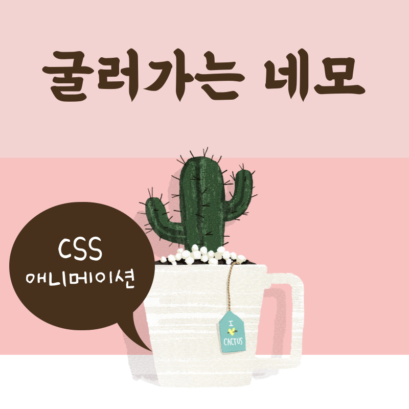
CSS 애니메이션 : 굴러가는 단무지
오늘은 CSS의 다양한 속성을 이용하여 애니메이션을 만들어 보도록 하겠습니다. 작업해볼 애니메이션은 다음과 같습니다.
See the Pen animation01 by mj0614k (@mj0614k) on CodePen.
1. HTML 소스
<div class="box"></div>
단무지의 그림자는 가상요소로 작업해줄 것이기 때문에, HTML 소스는 box 클래스를 가진 div 박스 하나로 충분합니다.
2. CSS 소스
body {
    height: 100vh;
    background-image: linear-gradient(to top, skyblue, pink);
}

.box {
    width: 50px;
    height: 50px;
    position: absolute;
    top: 0;
    left: 0;
    right: 0;
    bottom: 0;
    margin: auto;
}

.box::before {
    content: '';
    width: 50px;
    height: 5px;
    background: #000;
    position: absolute;
    top: 58px;
    left: 0;
    border-radius: 50%;
    opacity: 0.2;
    animation: shadow 0.6s linear infinite;
}

@keyframes shadow {
    0% {
        transform: scale(1, 1)
    }
    50% {
        transform: scale(1.2, 1)
    }
    100% {
        transform: scale(1,1)
    }
}

.box::after {
    content: '';
    background: yellow;
    width: 50px;
    height: 50px;
    position: absolute;
    left: 0;
    top: 0;
    border-radius: 3px;
    animation: load 0.6s linear infinite;
}

@keyframes load {
    17% {
        border-bottom-right-radius: 3px;
    }
    25% {
        transform: translatey(9px) rotate(22.5deg);
    }
    50% {
        transform: translatey(18px) scale(1, 0.9) rotate(45deg);
        border-bottom-right-radius: 40px;
    }
    75% {
        transform: translatey(9px) rotate(67.5deg);
    }
    100% {
        transform: translatey(0px) rotate(90deg);
    }
}
gradient은 '기울어짐'의 정도나, 기온이나 압력의 '변화 비율'을 뜻합니다. 즉 css에서 gradient는 한 방향에서 다른 방향으로 색이 점차 흐려지거나, 색이 변화하는 효과를 줄 때 사용하는 속성입니다. 백그라운드에 준 linear-gradient 속성은 상단을 향해(to top), skyblue에서 pink로 색이 변화한다는 의미입니다.
위의 HTML, CSS 소스를 합치면 애니메이션이 완성됩니다. 간단하죠?
728x90
'CSS' 카테고리의 다른 글
| CSS : SVG 도형 만들기 (4) | 2022.09.07 |
|---|---|
| CSS 애니메이션 만들기 : 공 튀기기 (1) | 2022.09.02 |
| CSS 애니메이션 만들기 : 빙글빙글 돌아가는 원 (4) | 2022.08.29 |
| CSS : 요소 숨기기 (10) | 2022.08.25 |
| CSS : 색상 표현 방법 (6) | 2022.08.23 |


댓글