728x90
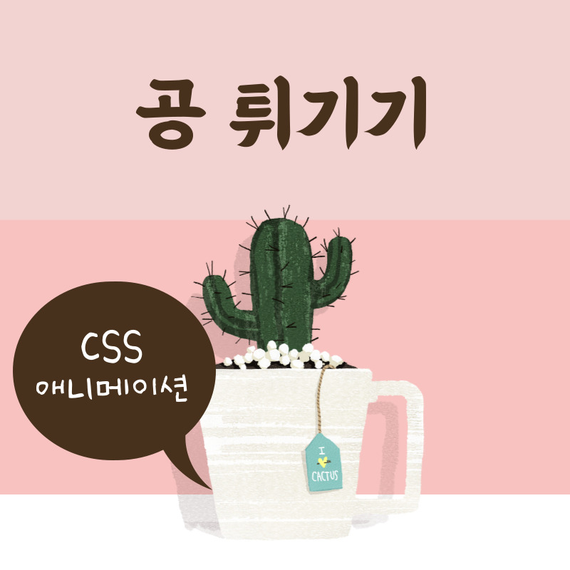
CSS 애니메이션 : 공 튀기기
오늘은 CSS의 다양한 속성을 이용하여 애니메이션을 만들어 보도록 하겠습니다. 작업해볼 애니메이션은 다음과 같습니다. 조랭이떡 같네요.
See the Pen balls by mj0614k (@mj0614k) on CodePen.
1. HTML 소스
<div class="wrapper">
    <div></div>
</div>
<div class="wrapper">
    <div></div>
</div>
<div class="wrapper">
    <div></div>
</div>
<div class="wrapper">
    <div></div>
</div>
<div class="wrapper">
    <div></div>
</div>
잔상을 포함하여 다섯 개의 공을 만들 것이기 때문에, 다섯 개의 wrapper 클래스를 가진 div 박스를 만들어 줍니다.
2. CSS 소스
* {
    box-sizing: border-box;
}
body {
    background: linear-gradient(to top, pink 0%, skyblue 100%);
    width: 100vw;
    height: 100vh;
    display: flex;
    justify-content: center;
    align-items: center;
    margin: 0;
    padding: 0;
}
.wrapper {
    position: absolute;
    animation: x 1s ease-in-out alternate infinite 0s both;
}
.wrapper:nth-of-type(2) {
    animation-delay: 0.1s;
}
.wrapper:nth-of-type(3) {
    animation-delay: 0.2s;
}
.wrapper:nth-of-type(4) {
    animation-delay: 0.3s;
}
.wrapper:nth-of-type(5) {
    animation-delay: 0.4s;
}
.wrapper>div {
    width: 50px;
    height: 50px;
    background-color: #fff;
    border-radius: 100%;
    margin: 40px;
    animation: y 1s linear infinite 0s both;
}
.wrapper:nth-of-type(2)>div {
    animation-delay: 0.1s;
    height: 40px;
    width: 40px;
    opacity: 0.8;
}
.wrapper:nth-of-type(3)>div {
    animation-delay: 0.2s;
    height: 30px;
    width: 30px;
    opacity: 0.6;
}
.wrapper:nth-of-type(4)>div {
    animation-delay: 0.3s;
    height: 20px;
    width: 20px;
    opacity: 0.4;
}
.wrapper:nth-of-type(5)>div {
    animation-delay: 0.4s;
    height: 10px;
    width: 10px;
    opacity: 0.2;
}

@keyframes x {
    0% {
        transform: translateX(-100px)
    }
    100% {
        transform: translateX(100px)
    }
}
@keyframes y {
    25% {
        transform: translateY(-50px)
    }
    0%, 50%, 100% {
        transform: translateY(0)
    }
    75% {
        transform: translateY(50px)
    }
}
body에 그라데이션으로 배경색을 주고, display: flex로 다섯 개의 공을 배치해 줍니다. position: absolute를 활용하여 한 곳에 공을 합쳐준 뒤, 애니메이션 딜레이 시간을 점차적으로 늘려주고, 크기를 점차적으로 줄여주며 잔상을 만들어 줍니다.
위의 HTML, CSS 소스를 합치면 애니메이션이 완성됩니다. 간단하죠?
728x90
'CSS' 카테고리의 다른 글
| CSS 애니메이션 만들기 : SVG (5) | 2022.09.08 |
|---|---|
| CSS : SVG 도형 만들기 (4) | 2022.09.07 |
| CSS 애니메이션 만들기 : 굴러가는 네모 (8) | 2022.08.29 |
| CSS 애니메이션 만들기 : 빙글빙글 돌아가는 원 (4) | 2022.08.29 |
| CSS : 요소 숨기기 (10) | 2022.08.25 |


댓글